
Earth Registry Brand Guideline
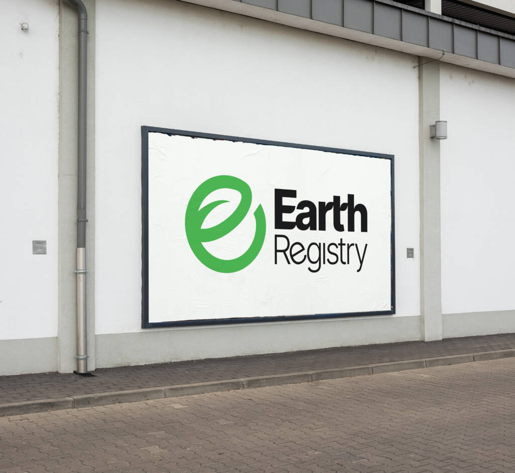
For this symbol, the focal point of your brand identity is the Earth. I incorporated
the letter E, along with negative space revealing a leaf design, to symbolize the
environmental focus of your brand. The circular direction of this symbol also
illustrates sustainability. This symbol complements the logotype, especially where
the sharp edges meet the rounded, similar to the typeface Inter.
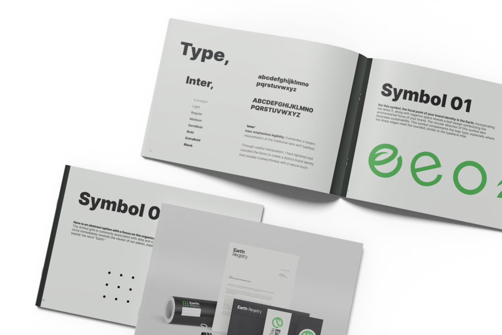
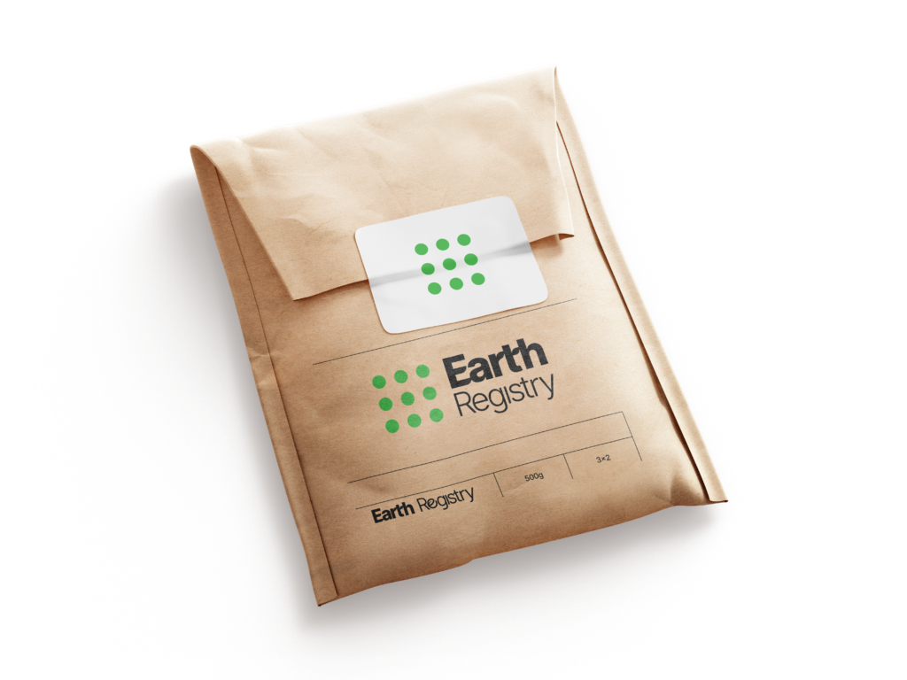
For this symbol, I wanted to create an abstract option with a focus on the
organization of data and trust. The dotted grid is commonly associated with
data and structure, while the green circle immediately reminds the viewer of our
planet, especially when paired beside the word “Earth.”